
IBM Watson Studio
During my time as a UX Designer at IBM one of my primary responsibilities was to develop initial on-boarding and improve first-time experience for our core users. The design team leveraged my fresh perspective to tackle this challenge while addressing often-overlooked assumptions and usability issues of the software.


Design Process / Case Study
Design Goal
Improve the onboarding and initial experience of the software for the core users and make the software more intuitive to use for first-time users.
Who is the core user?

Chris - Data Scientist
Chris likes to problem-solve and figure things out for herself. She gets deep into the data to uncover hidden insights for the business. She wants to quickly jump into using the tools that she’s familiar with and immediately start tinkering and producing.
Challenges & Pain Points
Keeping up with the many open-source innovations.
Determining which programming language to use - choose one standard or allow the data scientist to choose.
Difficult to collaborate across different tool sets and environments.
heuristic evaluation
Utilizing my fresh perspective and understanding of the core user I performed a heuristic evaluation of IBM Watson Studio. This process was valuable for identifying areas where the experience of the software could be improved by applying basic usability principles. Additionally, it uncovered numerous opportunities for design to more effectively address the immediate needs of data scientists.
primary takeaways
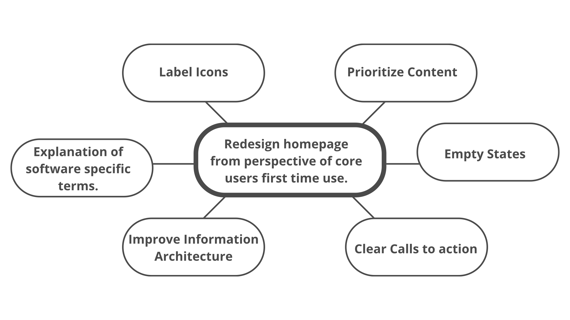
Homepage needs to be designed with the needs of our core user in mind.
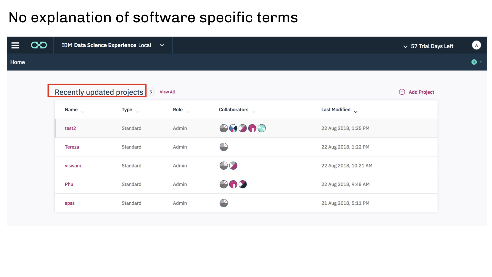
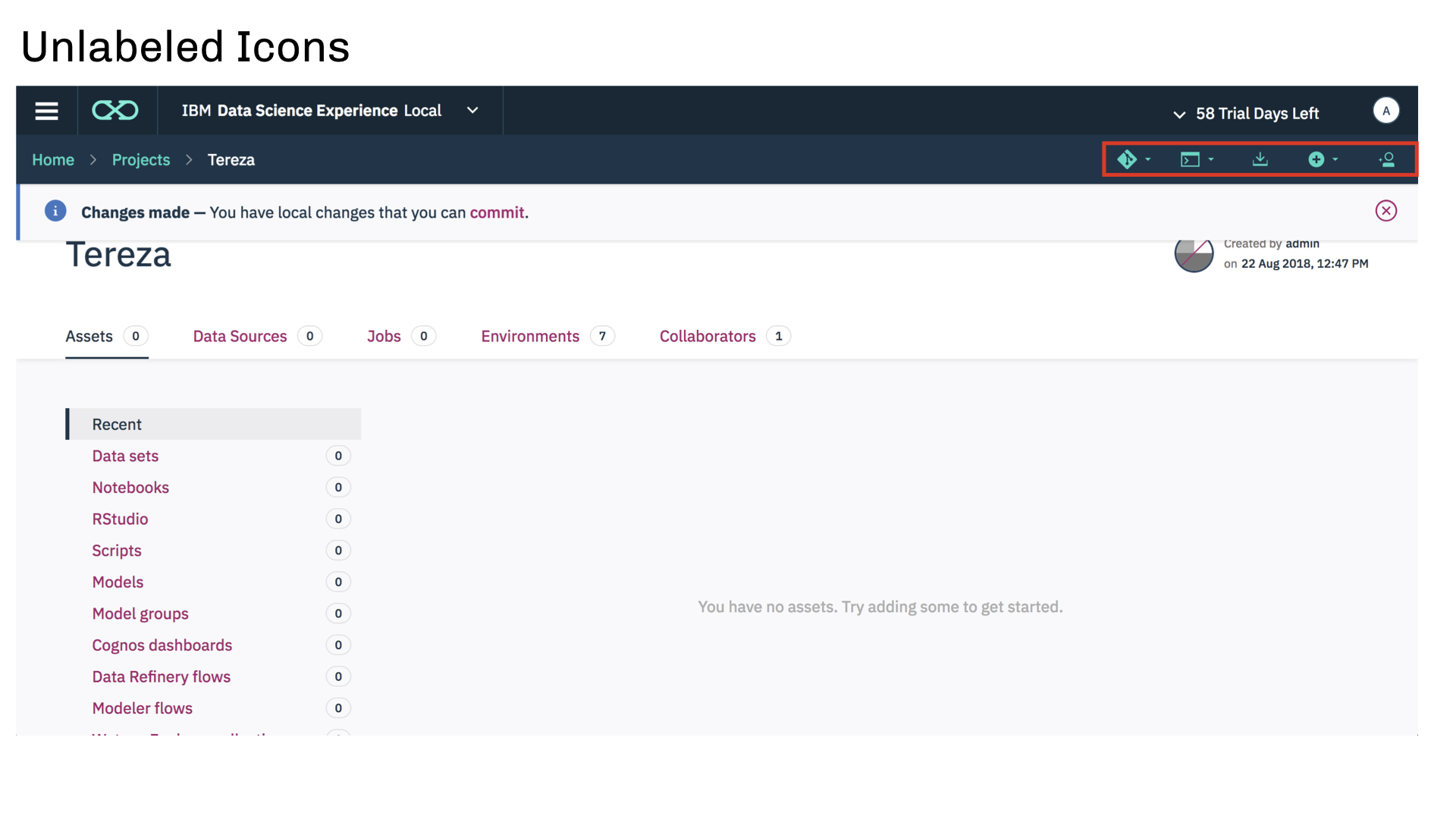
Icons need to be labeled.
Prioritize content that is most important to data scientists.
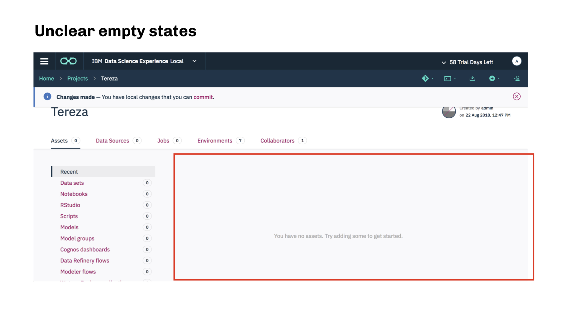
Make empty states informative and actionable.
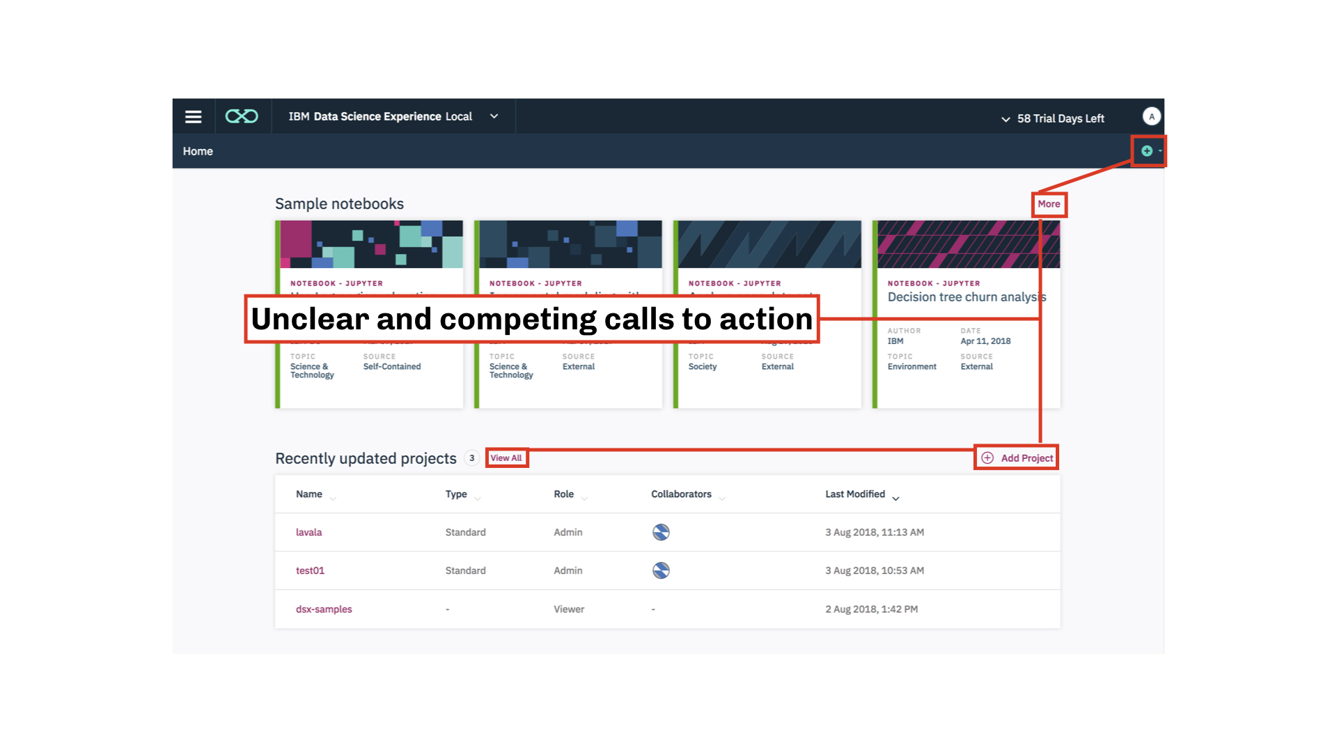
Establish clear call(s) to action.
Improve information architecture.
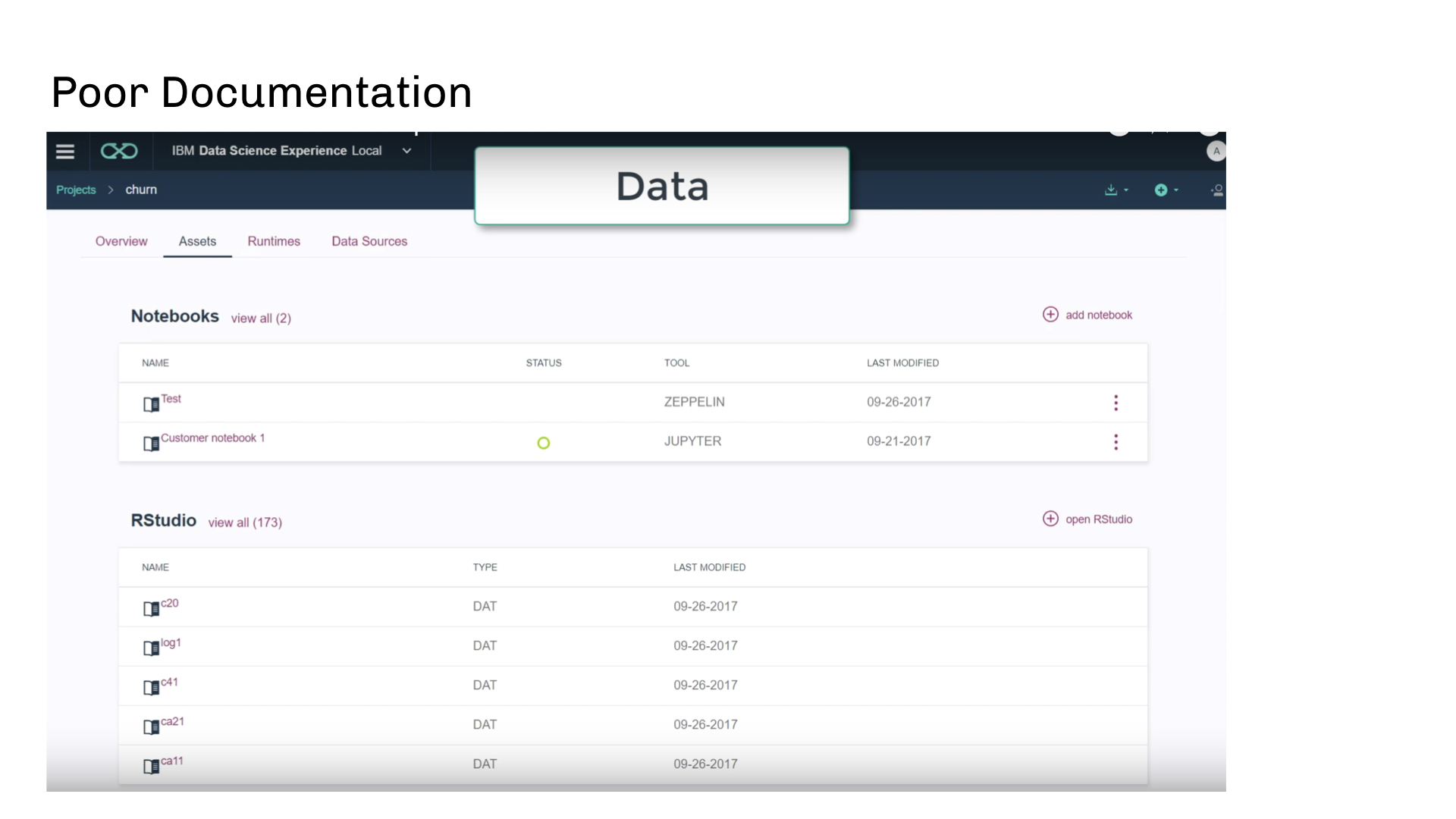
Explain terms that are specific to IBM Watson Studio.
After working with the design team it became clear that the best ways to enhance user on-boarding/ first time experience all connected to improving the home page. To accomplish this I needed to ensure that the software was intuitive and valuable from the perspective of our core user: data scientists.
Design exploration
How might we redesign the home page to address usability issues for first time use of data scientists? I iterated and developed dozens of designs, the following are the most promising design concepts from my explorations.
Concept 1 - Clear call to action
This design gives the data scientist a simple and actionable home page experience. I isolated the most important action for the core user. Additionally, the software explains in copy what a project is and why it is important.

Concept 2 - Top tools
In this concept the most relevant data science tools in Watson Studio are surfaced. This design gives the user the ability to jump directly into their favorite tool or they start by creating a new project to collaborate with team mates.
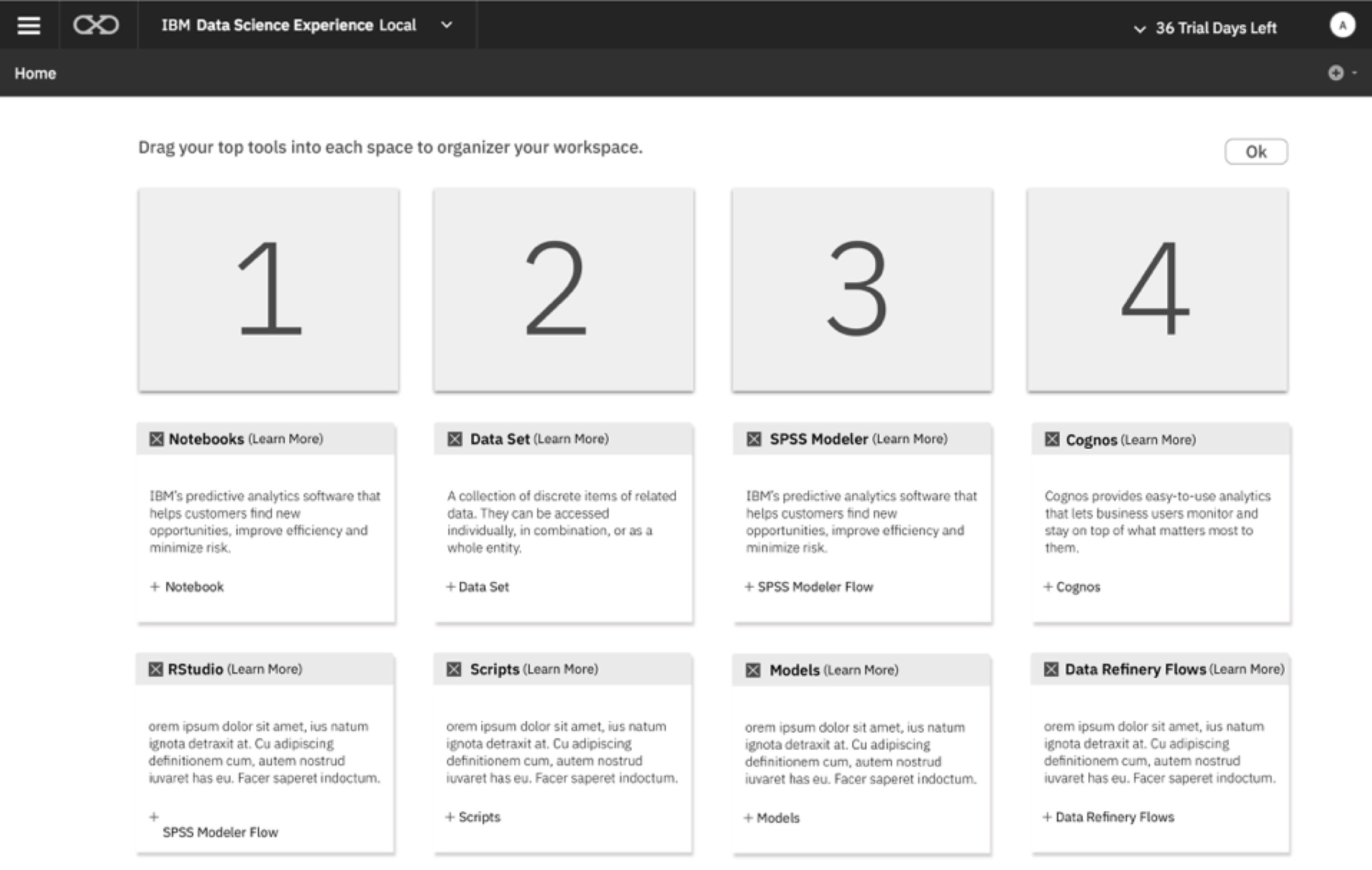
Concept 3 - customizable workspace
This design surfaces all of the tools in Watson Studio and gives the user the ability to customize their workspace with what is most relevant to them.
Concept 4 - Tool Box
This design presents Watson Studio as a tool box where the user chooses which tool they want to start working with.

Concept 5 - walk through
The first time experience of Watson Studio presents a walk-through that highlights where the most important functions of the software are located and a brief explanation of what they are. The goal for this is to quickly help users get oriented with core features of the software.

Concept feedback and convergence

I ended up with two directions for the redesign of the home page. These were considered to be strongest because they addressed many of the usability issues and were easier to implement. The other designs had strong potential but they also increased the burden on the already overwhelmed development team.

User research
In order to (In)validate the most promising design directions I developed an in-house user research study. I decided to leverage IBM’s large network and sourced several data scientist for the user study. Faced with a tight deadline I used an In-depth-interview format to generate insights and inform the next design decision.

objectives - gain insights related to the following topics
Validate landing page design concept.
Do data scientists understand what a project is?
Are data scientists able to discover the tools that they are familiar with?
Do users want to start a project or jump immediately into tools that they're familiar with?
Is one clear call to action effective? is too little information surfaced?
Do multiple calls to action confuse or overwhelm the core user?
takeaways
Less options on the homepage is better.
Users were confused by some of the tools in the top tools concept.
In both re-designs data scientists understand what a project is.
Data scientists want to start using the tool immediately and learn by doing.
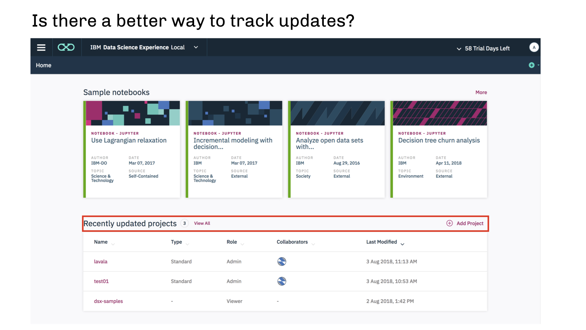
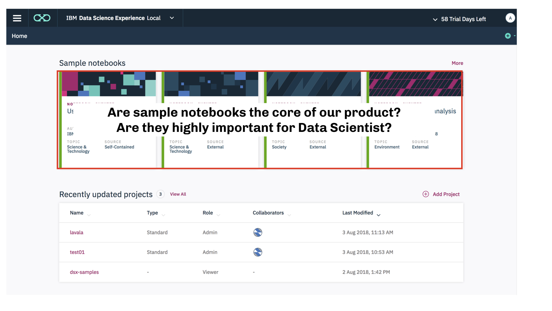
Sample Notebooks confuse our users and don’t provide value.
Conclusion
This work helped our team discover a way to enhance the first time experience of the software for data scientists. Using qualitative research reinforced the strength of the initial design direction. A more intuitive homepage design served as a big first step in creating a more intuitive adoption of Watson Studio.